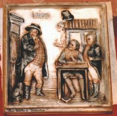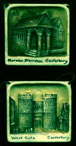
Fake is probably the wrong term for the "look-alike" plaques, because most of them were made by reputable companies who were simply producing a product similar to the Osborne ideal. In most examples the size is different, and in the majority the scene is different too.
In all cases the quality is not as good. They do not feel the same and, seen side by side, they do not look the same. There is not the same depth of modelling and attention to detail — although seen on their own, away from a genuine Osborne for comparison, or for the new collector, it is easy to believe some of them are Osborne Ivorex.
The main manufacturers who produced, in quantity, objects in a similar style to Osborne were Ivor Art in England, and in North America Ivor Tone and Bouterware.
Ivor Art
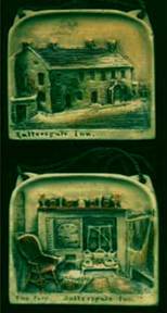
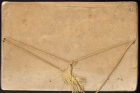
These are the pieces most often mistaken for Ivorex, being the closest in likeness to Osborne's work. They are trade-marked Ivor Art and carry an oval ink stamp on the reverse. This ink stamp is often very faded and is assumed to read 'Ivorex'.
They were made at a place in Blackheath Grove, London SE3 prior to the Second World War at a company run by Mr. Siggers. The company produced a wide range of plaques, bookends and decorative pieces prior to the 1939/1945 war. It is not known if the company survived the bombing on London, but there seem to be no obviously post-war items in existence.
The Ivor Art plaques are slightly thinner than an Osborne and tend to have a coarse feel to them. Although highly detailed, the depth of the modelling is not as great as on an Osborne Ivorex and the scenes have a rather shallow appearance.
General colouring is the same as the early Osborne plaques and they are also finished with a wax coating. Shapes and sizes can be almost identical to Osborne's and although the scenes are of a similar nature, they tend not to be of the same subjects.
Mini Plaques
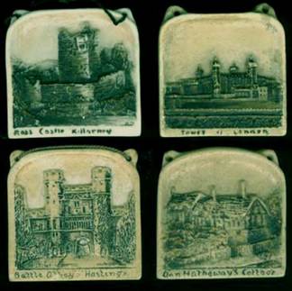
These four pieces are in the same style as Ivorex, but are Ivor Art. The examples are of the 'Tower of London', 'Ross Castle Killarney', 'Battle Abbey Hastings' and 'Ann Hathaway's Cottage'. Each are 2¾ wide by 2¾ by ¼ inch thick.
Osborne's sizes for this type of mini plaque are 3 inches by 3 inches by ¼ inch thick. Osborne used the same lettering style on most of his plaques, so a change in this style of lettering almost always points to another manufacturer.
One of them has the oval Ivor Art ink stamp on the back and all have the H.S. initials of their designer, Mr. H. Siggers.
Post Bridge Dartmoor
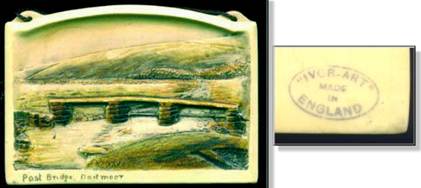
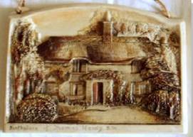
This very nice example of 'Post Bridge Dartmoor' clearly shows the Ivor Art similarity to Osborne's plaques, although the size, at 5½ × 3¾, is larger than an Osborne. The shape style is exactly the same. On this particular piece the Ivor Art ink stamp oval is clearly visible on the reverse. Again, the scene detail is much shallower than on an Ivorex and the general feel of the plaque is of a coarser final product. The finish is coloured and wax-covered in the Osborne style.
Shakespeare's House
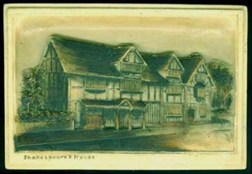
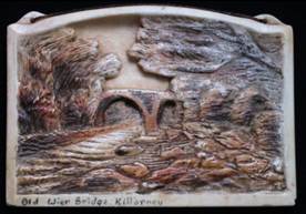
This is a good example of an Ivor Art plaque with the same scene as an Ivorex. The Ivor Art company made this scene in three sizes and with three frame styles, the largest being in the same style — although slightly larger — as Osborne's 9×6 plaque of 'Shakespeare's House'. There is an Ivor Art ink stamp oval visible on the reverse side.
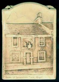
Tam O'Shanter Inn Ayr
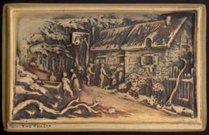
This 3¾ × 5¼ inch plaque of 'Tam O'Shanter Inn Ayr' has been in the wars a little — the top area has been broken and repaired, then crudely painted over. The colouring is poor and the scene is fairly basic.
Collector's tip: If you can see H.S. instead of A.O. on the front of a plaque, you know you are holding an Ivor Art piece.
The copyright ink stamp has either been over-painted or worn away, but on the front, in the bottom left corner, H.S. can be seen — the initials of Mr. H Siggers, creator of Ivor Art pieces.
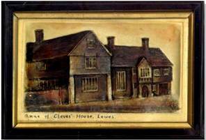
Decorative Figures
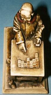
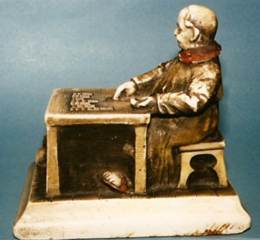
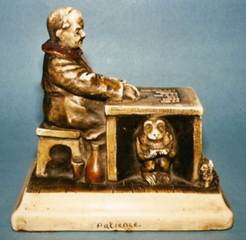
This piece is a model of a Monk playing the card game 'Patience', which is also the title of the model. It serves no particular function other than pure decoration but is a very nice item of Ivor Art works. There are no markings to indicate the maker, but the whole style of finish points purely to Ivor Art.
Bookends
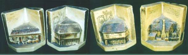
Many collectors will have one or two of these Ivor Art bookends in their collection. Because they are so similar to Ivorex products it is easy to get caught out, but they do look good and it's nice to have an example. The bookends are very rarely marked, but when they are, it is with the Ivor Art trademark. They depict scenes such as The Old Curiosity Shop, Burns Cottage, Bunyan's Cottage and others.
Ivor Art also made flat-backed bookends depicting the galleon, 'Sovereign of the Seas'. This galleon also appeared on a plaque and was used as the centre piece on oak fire screens.
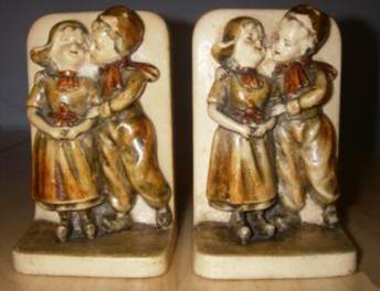
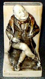
Osborne never got into the bookends market, but if he had then this is the sort of quality he would have produced. Made in England by the Ivor Art company, one could forgive the collector for thinking that these might be Ivorex. They are individually 4¾ inches high by 5 inches wide and 3½ inches deep.
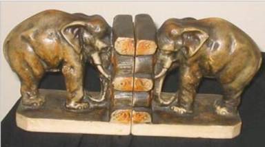
Calendar Holders
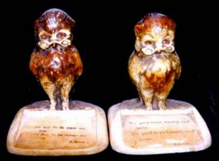
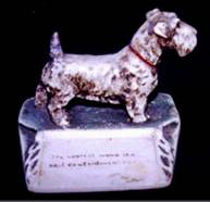
These Ivor Art pieces are calendar holders. The paper calendar would lay in the tray at the front with retaining cords passing through holes at each side. The wording on the owl's tray is from Burns: 'Its guid to be merry and wise. Its guid to be honest and true.' Osborne never made calendar holders in this style.
Bouterware
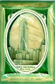
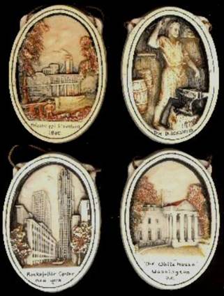
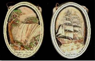
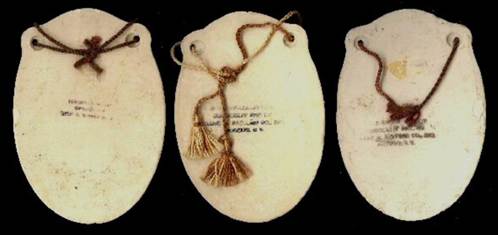
Bouterware was made in America by the Corocraft Studios, Frank M. Sayford Co, Inc of Brooklyn, NY and featured mostly American scenes and characters. Clearly marked on the reverse with the Bouterware trademark, and although very slightly thicker, they are very similar in shape, size and style to Osborne ovals.
It might be reasonable to assume that the company saw Osborne's product — which was imported into New York — and decided to make an 'American' version. These pieces are not usually seen in England, but there is a wide range of titles with at least 62 different scenes identified by fellow researcher Bob Court.
They are widely collected in the USA and are very often advertised for sale as 'Ivorex' by some dealers. Although very nice in their own right they do not compare in quality with the Osborne product. The plaster used appears to be rather brittle and chips are usually to be found on most pieces unless they are still in their original boxes.
Original Packaging
The boxes used for the Bouterware plaques are rather nice, being in the form of a picture frame, with the front open to show the plaque within, and the whole being covered in cellophane. Wording on the box front tells us that the plaque is genuine, hand-painted and yellows with age like old ivory.
The boxes come in a number of different colours and are a very good idea, giving the purchaser the opportunity to view the plaque without having to remove it from its protective box. The ovals are strung with a brown cord just like the Osborne ovals.
Identifying Markings
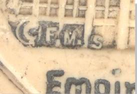
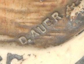
On the front of Bouterware plaques, often in some very obscure places, will be found the copyright symbol and the initials 'F.M.S.' for Frank M. Sayford. Also somewhere on many of the plaques are the words 'D.AUER' — who we can only assume may have been the sculptor of the scenes.
Ivor Tone Ware
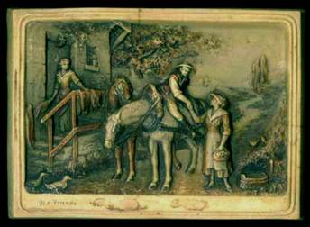
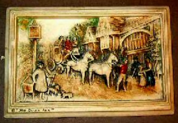
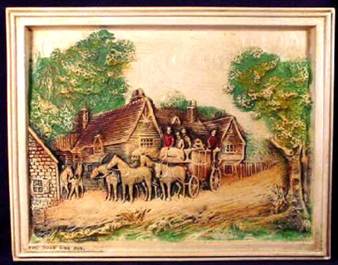
Ivor Tone Ware was made in North America depicting homely scenes in a variety of sizes and frame styles, made in the same manner as Osborne Ivorex and frequently sold as such. These are nice items in their own right with oval ink stamps to the rear, which are often faded and unreadable.
The absolute give-away to some of these pieces is the copyright symbol to the left or right of the title. Osborne never placed a copyright alongside his titles.
Another pointer is the drab green colour used on the foliage in these scenes. Osborne used a crisp sap green that could be applied sparingly for a light green or more heavily for a darker shade.
Known Titles
Other titles in the Ivor Tone Ware range that the Osborne collector needs to be aware of:
- 'The Swan Inn' 10 × 6¾
- 'The Road Side Inn' 10 × 6¾
- 'The Bell Inn' 9¼ × 6½
- 'Farm Life in Old Surrey' 10 × 6½
- 'Olde Mill Road' 9½ × 6½
- 'Home Sweet Home' 9½ × 6¼
- 'A Flemish Waterfront' 10 × 6½
- 'Peaceful Hours' 10 × 6½
- 'Happy Days' 10 × 6½
- 'Off on a Long Journey' 10 × 6½
- 'Shakespeare's Homestead' 10 × 6½
- 'Old Friends' 10¼ × 7½
Other Makers
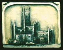
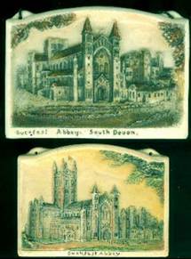
A 4¼ × 3¼ plaque of Gloucester Cathedral in the Osborne style. A nice little plaque, though not very detailed and a bit naive in style. There are no markings to indicate who it was made by. Osborne made no plaques in this type of shape with the strange cut-away lower section for the title.
The Guernsey Plaques
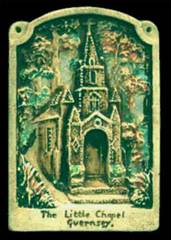
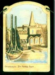
These plaques, by an unknown maker, are to be found in the same dimensions as the Osborne version of the Little Chapel, although on the Ivorex plaque the Chapel's builder is also shown. These plaques are slightly thicker, have a different cord hanging hole placement and are poorly painted in comparison. They may well have been manufactured in Guernsey.
Araplax
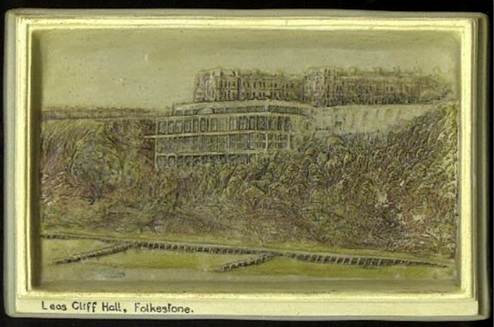
Here is an interesting plaque. It was made in England, and apart from the title lettering the style is 100% Osborne. However, on the ink stamp copyright on the reverse the item is named "ARAPLAX". It was sold by T. Ltd of Birmingham, one of Osborne's retailers, and measures 9¼ × 6½. In the bottom right corner on the front are the initials W.F.
Outright Fakes
This crude copy is by an unknown maker (American) and would appear to be a copy taken directly from an Osborne original by casting a mold from an Osborne plaque. The style of the text is Osborne's own, but fine detail in the scene has been lost and the shading has been sprayed on rather than applied by brush.
This piece should fool no one, as it looks and feels cheap.
Wedding Journey of Minnehaha and Hiawatha
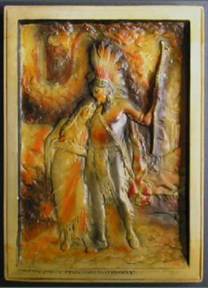
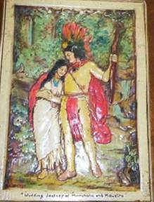
Of those plaques that were outright fakes of the Osborne originals, here is a perfect example — the 'Wedding Journey of Minnehaha and Hiawatha'. The dimensions are identical to the Osborne plaque so a mould must have been taken from the original. In doing this, although the basic shape and scene were reproduced, a lot of the fine background details were lost. And of course, the painter of this plaque was no match for the skills of Osborne's Faversham girls.
This fake is to be found in North America along with versions of the 'Old Folks at Home' and 'A Friendly Call'. They say that imitation is the sincerest form of flattery, but Osborne probably would not have been too impressed by this attempt at imitation.
Another example of the same scene — again to be found in North America. One difference is that the title has been centred, whereas on an Osborne it is to the left.
An Old Whaler
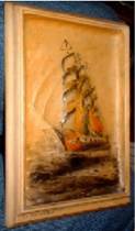
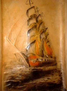
A 2008 Copy